BLOG
Two hard lessons about websites inspired by Captain Marvel
Plus tips to understanding what your website says about your business
Your website is your business in it’s
How does design impact the message that a site delivers?
It’s proven that design changes perception. At eResources, our first step in any discovery process is understanding the desired outcome of a website. Because color, space, motion, and responsiveness all drive users to either interact or find their information elsewhere.
Beyond the text in your H1, your site sends a message. Let me use an example that I’m super excited about.
Marvel’s latest addition to the MCU, Captain Marvel, was released on March 8th. For those reading that aren’t comic book nerds, Captain Marvel is set in the ’90s and those creative folks at Marvel took liberties with the website.
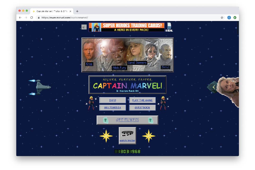
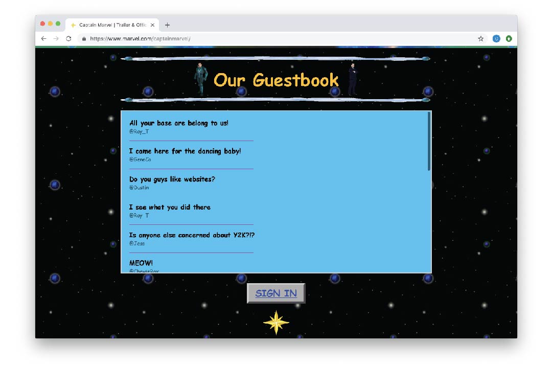
If you want to relive your earliest internet experiences, the Captain Marvel website is sure to please. It has all the early website elements like a “guestbook”, visit counter, and at least 8 different fonts. Check out the Comic Sans.
In the words of our marketing director, “this site is the gift that keeps on giving.”
That being said- take this website as an example of what you should NEVER do. Jokes aside, this website is the over-indulgent example of how users identify when a website (and the related business) is the outdated equivalent of a boarded up storefront.
There are two main pieces that impact a visitors experience.
Navigation
When a person visits your website, there are anticipated behaviors. Just like car keys, people look for things to be in the same place. Navigation is no different.
9 times out of 10, when you visit a website, there is a navigation bar. If there are too many pages, that navigation bar may drop down to allow quick access to those more specific pages. The company logo is either centered or top left.
This design was the product of years of sites “failing forward” from the design of the aforementioned Captain Marvel site.
When Design Deviates
When design deviates from this type of layout, it leaves customers confused. And a confused customer won’t be a customer much longer. “It needs to be where users expect it to be,” said Kyle Peterson, Lead UX/UI Designer at eResources. “They don’t have to relearn a new process or layout. Navigation isn’t the place to try tricky design tactics or implement a radical layout.”
Websites speak for your business just like a storefront would. Poor navigation design is the grocery store merchandising equivalent of putting spaghetti in the frozen food section. It’s just not right.
Appearance
Appearance is probably the most comical when it comes to user experience. The whole point of your website is to communicate. If design elements are working against that, removing them is better than poorly communicating with your customers.
There are a few easy rules to follow that make sure your site is in the clear.
Font
Make sure your text is consistent and easy to read. This means choosing a font that is easily legible. An easy rule of thumb- serif or sans serif. If you aren’t confident to expand beyond those two font types, you probably shouldn’t. Make sure there is a contrast between the text and the background and that the font is large enough to be easily readable.
White Space
White space is such a simple thing that makes such a huge difference. If you head over to the Captain Marvel website, you feel that impending anxiety attack? That’s because there is no break.
“White space when used correctly, not only makes a site look clean, modern and professional, but more importantly can help your website deliver a clear and direct message,” said Peterson. “With well-balanced white space, action buttons stand out, text is more readable, and users can scan, comprehend and consume the content you intend them to.”
Bad Gradients
In my personal opinion, nothing says this site hasn’t been touched in 20 years quite like banded shades of brown. Worse: plastic shading on buttons.
Graphics and Photos
Using clean graphics has countless benefits. They tend to be small files that load incredibly easy when using a mobile connection or on a throttled connection. A site that loads quickly is just like having a sales representative that responds quickly.
However, users do tend to engage better with a face to your site. “Users not only connect better with photography (especially photos of people/faces), but it can also show a more personal side to your organization, team or mission.” Photography allows your business to be associated with a specific entity or person, rather than a concept.
“That said, I only recommend utilizing photography if you have access to high-quality photos. Using bland/cheap stock or poorly composed/uninteresting photos doesn’t reflect well on your website and won’t engage the viewer,” said Peterson.
Designing for results
While the Captain Marvel site is a quirky tool drummed up by marketing geniuses, it’s also a very tangible example of what your website shouldn’t look like.
Design your website to be an enjoyable and informative experience and the results will follow. When your office is closed, your website is still actively communicating on your behalf. What’s it saying?
Other Articles You Might Be Interested In:

Computers & Networks Inc., merges with eResources LLC
News Memphis, Tennessee - September 27, 2022 eResources, a leading national technology consulting and IT managed services provider has grown! Our merger with Computers & Networks Inc. of Memphis, Tennessee completed on September 6, 2022. Speaking about the merger,...
How to Write an Email that Works
News If you are reading this, you are having one of two issues. People don’t bother to open your emails. or People aren’t reading or taking action on those emails. The good news is that you are not alone. Fortune 500 companies have email marketing teams of developers,...