BLOG
Is Your Website Mobile-Friendly?
Mobile optimization is no longer optional.
Every day, Google changes their algorithm, sometimes twice a day. That sounds like a lot, right? Most of these changes are so minute that they don’t affect use or change functionality. Sometimes they don’t even get noticed.
Every so often, however, Google rolls out big changes. This was the case on April 21st, 2015 for “Mobile-
Let me explain why.
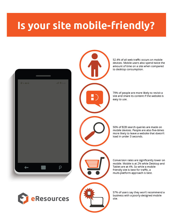
These statistics are just the tip of the iceberg. Google needs to provide the most relevant search results for its visitors so it can remain the search engine behemoth that it is; that includes being aware of what websites visitors are willing to use.
How to know if your site is mobile-friendly
Google isn’t the bad guy in the corner waiting to crush your SERP. They provide a great tool to identify whether your website is mobile-friendly.
Click here to visit Google’s Mobile-Friendly Test.
How Your Website Needs to Change for Mobile
- Load Time – Large, uncompressed images, native video, or unnecessary characters in your source code delay mobile users from viewing your website.
- “Finger-Friendly” – Make sure your site’s text is easily visible and buttons are appropriately sized as to only be selected when they are supposed to be. No one likes being unintentionally redirected.
- Remove Pop-ups on Mobile – On a desktop, pop-ups are easy to navigate around. On mobile, they are often cumbersome to remove. It’s easier for a visitor to leave the site rather than dodge the pop-up. This increases your bounce rate thus, dropping your SERP.
- Local Optimization (if applicable) – Adding geographic information helps drive foot traffic. According to ThinkwithGoogle, searches containing the phrase “near me” are up 500%. 84% of those searches were made on mobile devices.
Mobile optimization is no longer a perk of a good web presence, but a necessity to do business. Desktop users research. Mobile users take action.
Talk to one of our Digital Specialists about Mobile Optimization
Other Articles You Might Be Interested In:

Computers & Networks Inc., merges with eResources LLC
News Memphis, Tennessee - September 27, 2022 eResources, a leading national technology consulting and IT managed services provider has grown! Our merger with Computers & Networks Inc. of Memphis, Tennessee completed on September 6, 2022. Speaking about the merger,...
How to Write an Email that Works
News If you are reading this, you are having one of two issues. People don’t bother to open your emails. or People aren’t reading or taking action on those emails. The good news is that you are not alone. Fortune 500 companies have email marketing teams of developers,...